Support Overhaul by gerg
The idea I had to overhaul the Support System is documented on this page.
Instead of like on LJ and clone sites, where you can just go to the request page and type, this system attempts to figure out the most useful information that the user needs at the time and shows it to them.
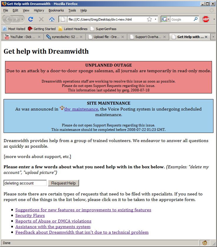
Instead of the current request submittal form, clicking "Help" would take the user to a page like this:

There, we can say text about the support system, estimated wait, etc. but it also gives the user a very clear idea of how to move forward (type a query into the box.) There are also links to the special forms for abuse, feedback, webmaster, payments, and suggestions. Outages can be reported in the BRB (big red box) and planned maintenance can be reported in the BBB (big blue box.) This is intended for things that affect the entire site, not small issues. Small issues can go in KI files.
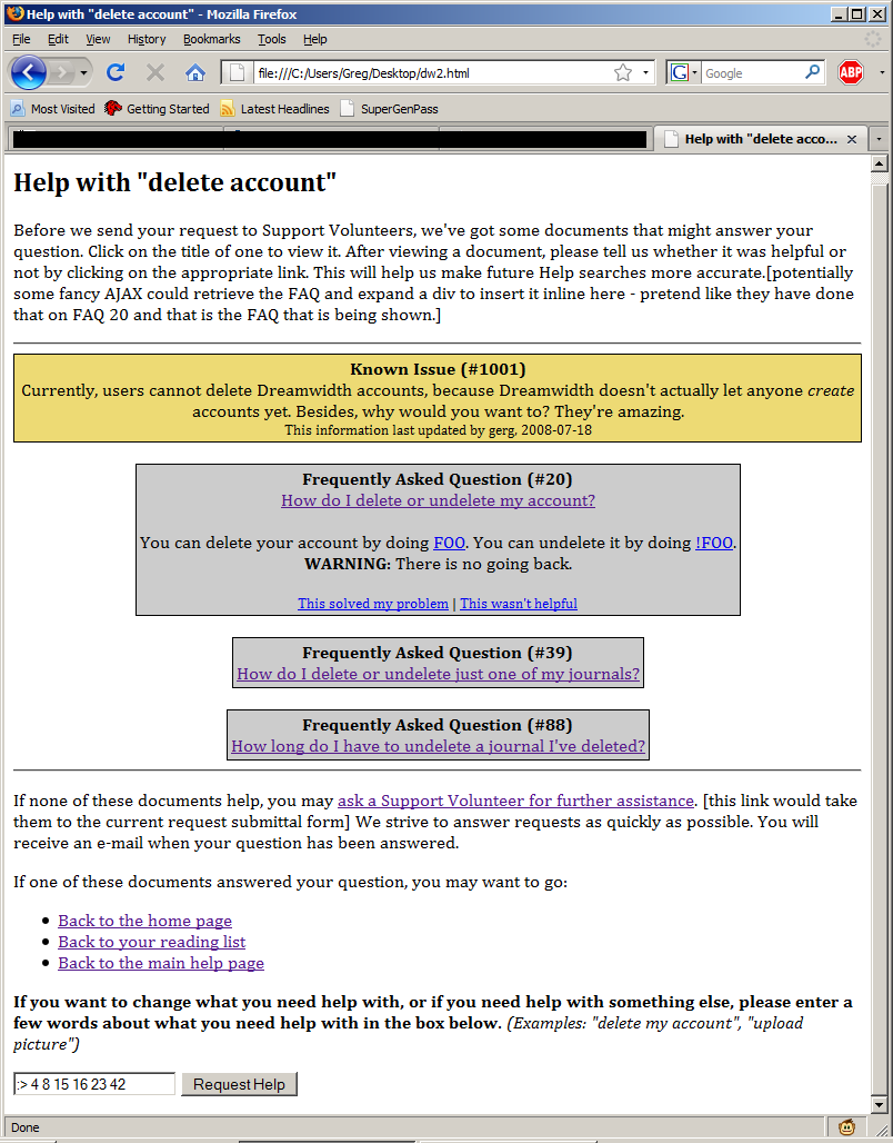
After the user enters what they need help with, they see a page like this:
The gold box appears if a known issue file is entered for that search term. KI files would be like FAQs, but in a separate database. Anyone with supporthelp priv would be able to create them, and they provide a way for small issues (like the RTE not working right in FF3, or the statistics not working for Russian users, etc.) to be able to be stopped from even filing requests, without polluting the box on the main page that will contain genuinely important things. If the user finds a FAQ helpful, a link can be added to the bottom that says "This solved my problem" that will note what was searched for and which FAQ answered it, to ultimately refine the FAQ database and to provide stats. (This suggestion from ![]() tango) Then, if the user doesn't think any of that is helpful, they can click the link to get to the request form anyway.
tango) Then, if the user doesn't think any of that is helpful, they can click the link to get to the request form anyway.
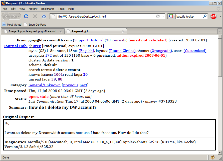
After that, the request is handled the same way. However, I am proposing a few changes to the see_request page as well. Here is my new version:
The changes are small but important. First, the userpic is gone (oh no), but that's OK, because users can see all the pics anyway, by clicking on the number of userpics they have left. First, the concept of "accounts" exists on DW - and that's the first line. The single login that corresponds with however many accounts can be linked and information about that account are on the first line. Then, information about that particular journal is available. Userpics are broken into base and purchased, so that UPI volunteers can see if the user currently has paid userpics. Expiration dates on paid time and UPI addons are listed. Since DW is moving to a selective model, I think it is likely our vols will be given access to this info, hence it on the new see_request. The text on how many UPIs are used is also important so that people who have uploaded too many and have had some go inactive could be identified.
The next set contains the search terms the user used to get to the request form, the known issues files that were presented to them (if any), and the FAQs that were given to them. I envision that FAQs can be much shorter and much more direct answers to questions if this system is implemented. This way, volunteers know what has already been said to the user, so that there aren't "but I already tried that" fests. They also can say "as was shown when you opened this request, the system is down, yo." as appropriate. The last thing is to add the "stale" and "(over 48 hours old)" tags. This could be configured by category and would flag requests over a certain age maybe in a brighter shade of green or something.
Also, showing the search terms and the resulting FAQs on the request page lets volunteers say "Hey, FAQ #283 should be linked to people who search for "applesauce"." i.e. If they are constantly referencing FAQs that the system doesn't find, the FAQs can be tagged to come up when a certain keyword is entered.
The color scheme works out to be: Red - Outage, Blue - Maintenance, Goldenrod - Known Issue, Gray - FAQ Reference
Additionally, ![]() tango suggests here (
tango suggests here (![]() gerg):
gerg):
"Based on this design, it would make sense to me to have email requests checked over for key words (delete, unsubscribe, etc) and possibly email the users the relevant FAQs when their request is created and the request details indicate which FAQs were sent out." - which I agree with. The autoreply could be something like:
Dear greg@dreamwidth.com:

Your request to Dreamwidth's Support department has been filed and assigned request number 12345.

You may view this request at http://dreamwidth.com/support/foo.

Below are some resources that my help answer your question. If one of them does so, please click on the link at the end of the document, and your request will be closed.

FAQ #28: How do I delete my account?
To delete your account, do foo.
If this answered your question, please click here: http://dw.com/support/act.bml?close&faq=28&req=12345&auth=kjyd

FAQ #84: How do I shot web?
[img-timeline]
If this answered your question, please click here: http://dw.com/support/act.bml?close&faq=84&req=12345&auth=tcks
...

If none of these documents helped, don't worry. A Dreamwidth Support Volunteer will get back to you as soon as they can.

signature, etc.
Then, the requests would show up on the request board with a status of "Self-closed" and then on the request detail page "Closed by user with FAQ #XX". They could also show up in a user's support history (and, of course, be filtered out of a user's support history if the volunteer helping them wanted to do so), so that if a user had a lot of trouble with one thing and had obviously searched a lot, volunteers could take that into account.

